Joined: Fri Mar 10, 2006 1:00 am Posts: 587 Location: Hyde Heath
Website Logos
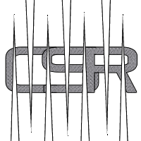
Just a few more designs ive put together, what do people think? Remember they have to work with white background. My fav is no.5 but i think no 1 will work best with the website.
1
2
3
4
5
Fri Jul 28, 2006 12:20 am
Bulla
Moderator
Joined: Thu Mar 09, 2006 1:00 am Posts: 606 Location: Crawley
Lol looks like you've really tried to emphasise the 5th one. Yeah i'll agree that's my fave, it's much smoother than the others. The others are all sharp and autoshapey!
_________________ Bulla
Fri Jul 28, 2006 12:37 am
Cubbage
Master
Joined: Thu Mar 09, 2006 1:00 am Posts: 575 Location: Aylesbury
Yeah the 5th one is probs the best one.
_________________ Cubbage
Fri Jul 28, 2006 8:34 am
Dave
Administrator
Joined: Tue Mar 07, 2006 12:14 am Posts: 1521 Location: Keepin' it Street
They're all too square we need something less so like the current one up there.
Users browsing this forum: No registered users and 3 guests
You cannot post new topics in this forum You cannot reply to topics in this forum You cannot edit your posts in this forum You cannot delete your posts in this forum You cannot post attachments in this forum